Thanks for the answer. I'll get back to you once I'm done with the references then. :3cOriginally Posted by qoxolg


Thanks for the answer. I'll get back to you once I'm done with the references then. :3c

Also, can be anything. Characters from other games, OC's, cartoons, anime, whatever. As long as there is a large pool I can pick from, because I will make the pose first and then pick whatever character I will draw on top of the pose.

Well you've already drawn Levia, so that shouldn't be an issue. Right?
I messaged my martial arts instructor to see if he can find any good technique manuals. No response yet, but, he tends to be a good resource.
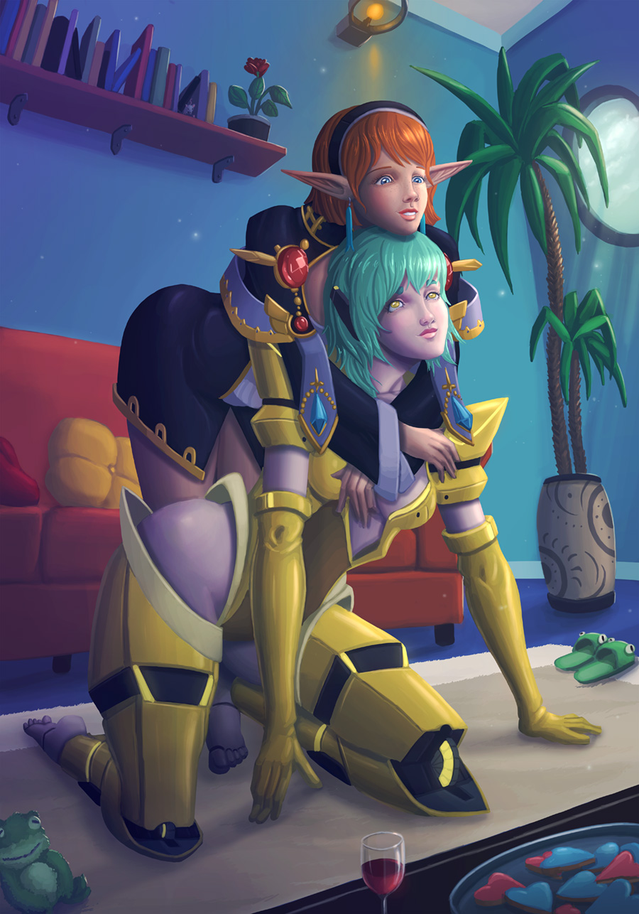
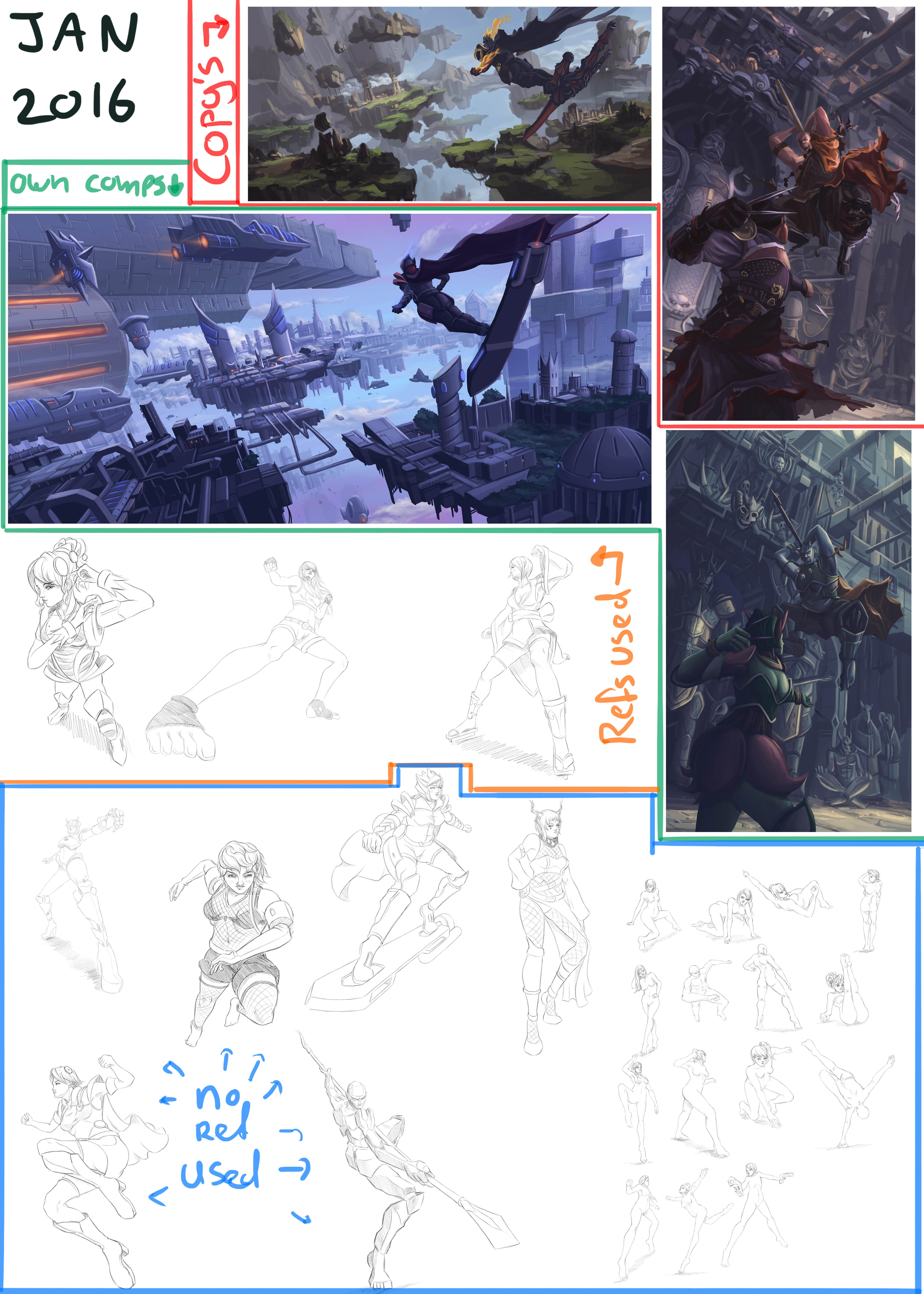
January practice stuff
Spoiler!
Nope, no response from him. Guess I'll have to do digging on my own.
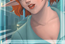
Beautiful work as always.
Wow! This is really good!
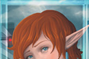
This was a response to this drawing Mimo made: http://min-t-drop.deviantart.com/art...vely-590932023
I wish I could do that. Spontaneously create something just because I feel like it. How long did this take to make?
And are those improvements on the face that I see? They look different than usual.
Also, that picture you linked was flagged as mature for some reason. I guess Qoxolg is just that sexy.
Last edited by Zorafim; Feb 17, 2016 at 12:00 PM.
I didn't really keep track of time. I started the sketch on my iPad and later decided to color it on my computer, because I liked the sketch.
I think I have picked up a thing or two when it comes to poses and faces while doing all this practice.
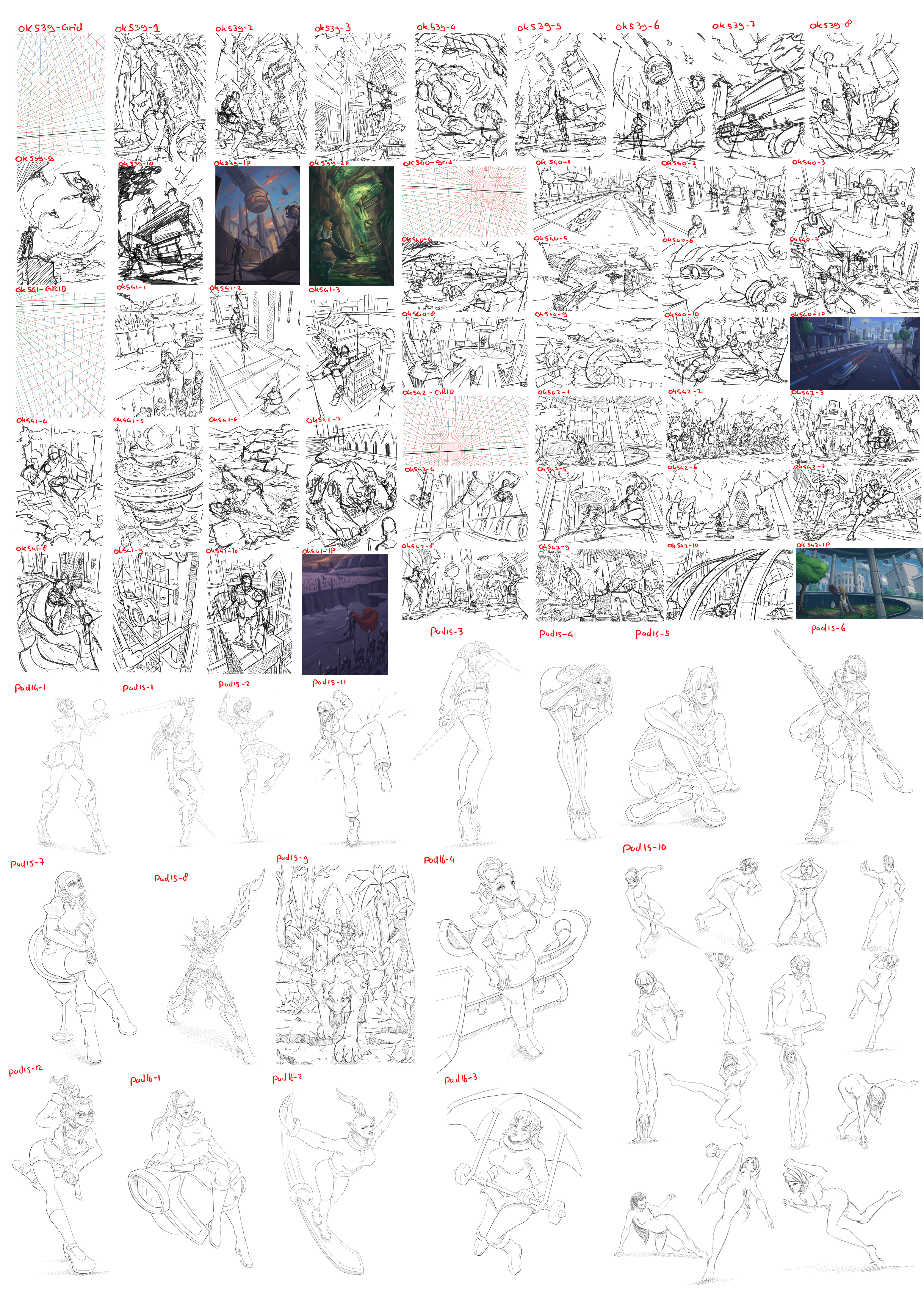
Feb2016 practice:
Spoiler!
Alright, here are the result of my practice for the month February 2016. I did some of the characters from you guys. I'll try to send you a message with the full resolution version.
For this month I decided to do some reflection upon the work I have done on the last day of the month.
Other then the previous two months, this month I decided to stop copying KD Stantons work, because I felt it was taking to much time and I couldn't get much practice in on my compositions working that way. I did learn a couple of things from copying KD:
1. My compositions suck and lack any kind of depth
2. Diagonal horizons are cool
3. I should use more vertical convergence than I thought
4. My painting skills sucks, but I am gonna practice more on that another month.
5. My visual library is empty
Ok, so my idea was to create four different perspective grids, and create 10 rough compositions on them.
I put the names on top of each drawing (yes, I've been numbering my drawings for like 8 years, because I don't really like naming them).
OK539-GRID
Vertical canvas (5:7), low horizon. I think I prefer low horizons over high ones.
ok539-1: The creature and the character riding it are okay-ish, but whats with those weird panels?
ok539-2: I kind of like this one. I think the character in the foreground works pretty well and I like the over arching trees on top of the cliffs.
ok539-3: lolwut? This really looks unappealing. The character looks very disconnected from the scene.
ok539-4: I only like the character in the foreground. The rest is a mess.
ok539-5: The background is semi-interesting but the character is to big and ruins it.
ok539-6: I kind of like this one. I think the curved wall helps to break the perspective a bit.
ok539-7: Yeah, this might work. The background doesn't look super interesting, but I think it could become ok-ish if further refined.
ok539-8: I like the idea of the background and the action of the character. I think breaking the perspective grid helps make the composition more interesting at times.
ok539-9: Looks crappy, but it was a nice idea to try not following the perspective lines, but still feel like it could fit inside of the grid.
ok538-10: Ugly!
OK540-GRID
Wide screen canvas (16:9), high horizon. God I hate high horizons, though I do prefer wide screen format.
ok540-1: Myeah, sort of okay, but boring.
ok540-2: Could work, but I don't like the emptiness of the ground in front.
ok540-3: AYE AYE CAP'N! The idea could work, but would need lots of refinement. Maybe more shapes that aren't aligned to the grid.
ok540-4: My art teacher wanted me to draw a zoo, so ZOO! and it sucks
ok540-5: Could work. Needs some more interesting stuff on the ground. I think I had Skies of Arcadia in mind while making this one.
ok540-6: Herpderp
ok540-7: Scale is al wrong. Characters are way to big for the background.
ok540-8: I think I like this one. The back background could use some work, but I think this could be interesting. I think I should make more use of ellipses in my compositions.
ok540-9: dumb
ok540-10: Scale sucks but I like the action of the characters.
OK541-GRID
Vertical canvas (5:7), high horizon, worst of both worlds! How could this go wrong?!?
ok541-1: Seems like a good start. A bit boring in the back, but I like the foreground.
ok541-2: boring
ok541-3: Wuts going on here? looks like a boring city. Character looks broken. Depth is okay-ish.
ok541-4: Dragon punch? looks crappy
ok541-5: whattheidon'tgetitisthefuckisthis?
ok541-6: ugly
ok541-7: sorta okay. The character in the foreground looks wrong, like he's way to tall.
ok541-8: What the hell is that character doing?
ok541-9: Looks sort of okay, but boring. It fallows the grid to much.
ok541-10: Character scale is not right. He is to big. Also, not enough foreshortening on the character.
OK542-GRID:
Wide screen canvas (16:9), low horizon, I think I prefer this kind of canvas.
ok542-1: Myeah, this could work. The stuff in the back is a bit boring though, but I like the foreground circular shape.
ok542-2: Could work, but not very original
ok542-3: Yeah, kind of like this. I think I got the scale of things more 'right' in this one.
ok542-4: Poop
ok542-5: Crappy background is crappy. I need more visual library.
ok542-6: I like the hand coming out of the water (or lava, dunno anymore). The rest is not very interesting.
ok542-7: Oh yes, I think this could be a cool painting. I like the action in it.
ok542-8: Could work. Scale is not right, but I like the shapes of the background.
ok542-9: Myeah. A bit boring, but could work I think.
ok542-10: This is okay-ish. I like how the arcs are not aligned to the perspective grid.
OK, so what did I learn from this?
1. My visual library sucks
2. I should use more ellipses in my composition
3. I should try to break up the perspective grids to make things more interesting
4. I should pay more attention to scale of characters in the composition. I usually make them to big
5. Some days are just bad days for art.
Because | had some time left this month, I did some quick paints of a bunch of these (30-60minutes).
ok539-1p: ewww, but I kind of like the clouds I guess
ok540-1p: meh. Looks so washed out.
ok541-1p: I had no idea this could come out so crappy
ok542-1p: why am I fucking this up?
ok539-2p: Ok, so now I had enough of it and decided to paint it differently. I started painting on thumbnail size to block in the big shapes of light, shadow and color. I then used a 70% brush to paint thing in. I think this really worked pretty well! I kind of like where this is going. I should try to use this process more often.
BUT I DIDN'T JUST DO COMPOSITION ALL MONTH! I ALSO DID SOME POSE PRACTICE!
So pose practice is about creating more interesting poses from imagination (so no refs were used to create the poses). I then fill them with anatomy (also no refs) and draw a character on top of it, to keep it interesting for myself.
pad14-1: I think I made this last month for my last KD Stanton copy. I think I forgot to include it last month.
pad15-1: Armpit area of her left arm looks wrong. Also think her left breast should be a little higher.
pad15-2: Breasts are a bit to low for this angle. Her left leg is a bit to small. Foreshortening of the arms looks a bit irky.
pad15-11: WHATS HAPPENING WITH HER RIGHT ARM?!
pad15-3: I think I like the pose of this one. gives the feeling of a low view angle.
pad15-4: Legs might be a bit to long, but I kind of like that.
pad15-5: Don't really like the face. Her right arm is a bit to small. It should have been more foreshortened backwards.
pad15-6: Don't like the face. Should be a dude I think.
pad15-7: Bad job on the face, perspective is wrong and the chin doesn't look right.
pad15-8: I didn't understand this armor at all. Foreshortening of the arm in the front is off. Body looks a bit to short to me.
pad15-9: wut?
pad16: The pad16 drawings are designs from an old trading card game I collected as a kid. It was about all kinds of planets with aliens on them. I collected almost all of the cards available.
pad16-4: I kind of like this one.
pad15-12: Foreshortening of her right arm looks wrong. Also the right hand is crappy. Center of her face looks off.
pad16-1: Breasts don't look good. Legs also look off.
pad16-2: Big boobs! Her mouth looks so off! I think it's because the nose also is, which is probably why moving just the mouth around didn't help.
pad16-3: LOL! whats with the breasts? Hands look bad, especially the knuckles.
pad15-10: Lots of random quick poses. In general most of these suck. I should pay more attention to the size of the upper body.
All of the poses are sketched with ProCreate on my iPad. The compositions are done in Photoshop on my computer.
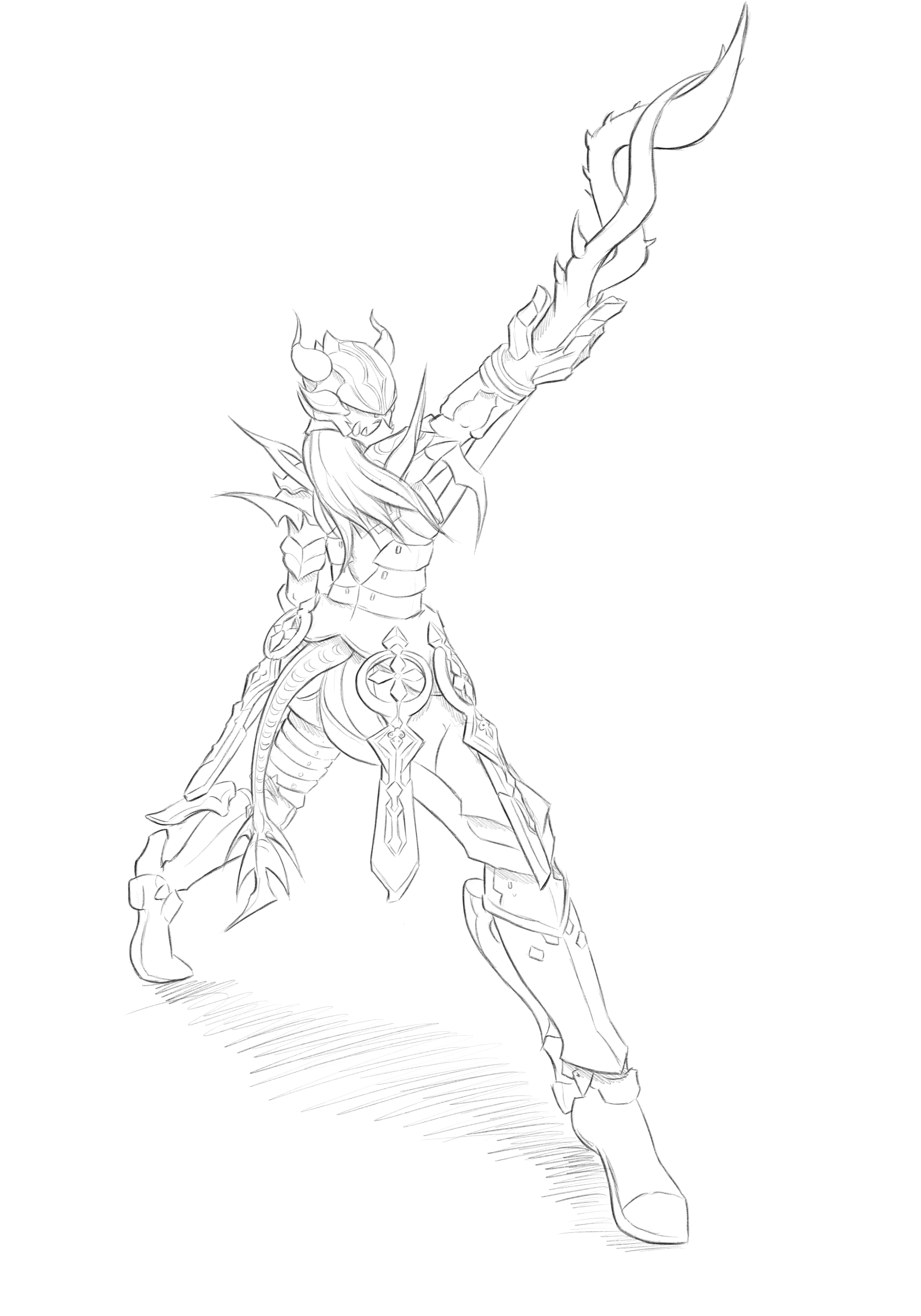
This one was for Zora I think:
Spoiler!
 Posting Permissions


 Reply With Quote


Connect With Us