Page 1 of 2 12 LastLast
Results 1 to 10 of 12
  1. #1

    Default

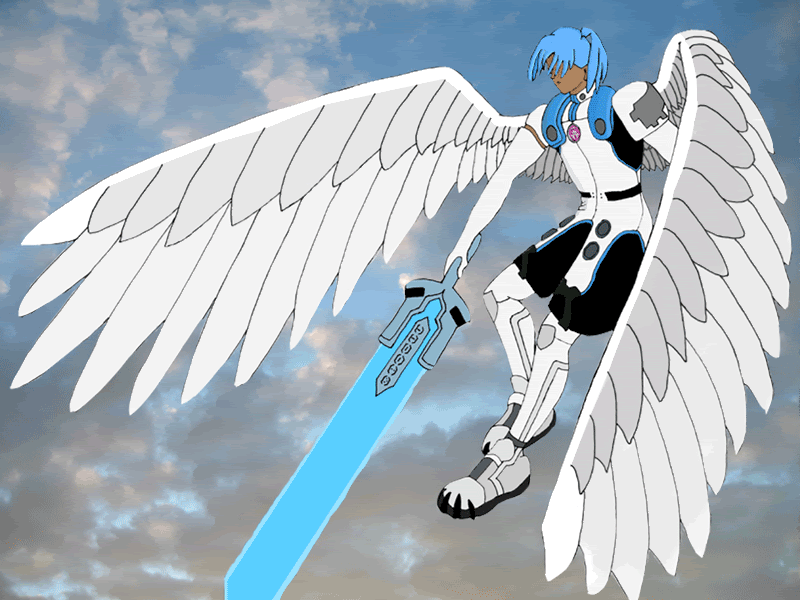
    Lurking around for a year has made me really self-concious about what to post among so many opinions. From a spurt from a friend, I decided I might as well post my picture seeing as I don't actually meet anyone face to face.


    Lack of depth, lack of shading and highlights are all because I haven't learnt how to shade in Photoshop yet! Ha ha ha ha! But oh well. I appreciate any and all comments. I'd also like tips on how to shade and highlight in photoshop. I have the 7th version and I'm running on a Mac. I also have Illustrator 10 if that helps at all. To colour in this picture, I used the Eyedropper tool, the Magic Wand and the Bucket tool.

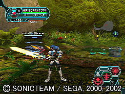
    The picture I used was this one:


    EDIT: Changed the picture format from .jpg to a .png.
    2nd EDIT: Jastily added a background taken from outside my window. Doesn't quite fit but now he doesn't look like he's about to fall over.

    <font size=-1>[ This Message was edited by: biggabertha on 2006-05-29 06:23 ]</font>


    <font size=-1>[ This Message was edited by: biggabertha on 2006-05-29 16:49 ]</font>


    <font size=-1>[ This Message was edited by: biggabertha on 2006-05-29 17:10 ]</font>


    <font size=-1>[ This Message was edited by: biggabertha on 2006-05-29 17:11 ]</font>

  2. #2
    Team Cyber Scale coordinator
    Join Date
    Mar 2006
    Location
    on the bottom of the deep abys (AKA my room)
    Posts
    272

    Default

    wow! really beautiful! I love that pose


    I'm almost finished with a shading tutorial, I hope it comes handy for you :3 you have some real nice talent there

  3. #3

    Default

    I like it as well!
    You don't usually see dudes as angels, so the subject matter is fresh. As for shading, there's kind of 2 kinds to try. "Cell shading" where there's like 3 different tones of each color and the edges are really defined, which it looks like the drawing may be starting on the path of. I am really not so hot at this type...but if you like the bucket/wand method, this may be easier for you.

    The other is you go in with the airbrush/dodge/burn and throw your own gradiations onto it, which is what I tend to go for. I started off in pencil/oils so this method is my favorite, although I'd really like to learn cell better.

    If you decide to shade it, post that up too! Probably everyone would like to see how it turns out. Since you lurked for a year, do you have any more arts?

  4. #4
    Down for the Getdown
    Join Date
    Dec 2005
    Location
    The 36 Chambers
    Posts
    2,301

    Default

    BEAUTIFUL.
    I like that pose too.
    Sorry, but i don't have any advice for you. I'm more of a writer and not an artist.

  5. #5

    Default

    Man, that's awesome. The hair looks a little like wings or feathers itself, which I think is really cool. What do the letters on the sword spell?

  6. #6
    Scarlet Spirit PhotonDrop's Avatar
    Join Date
    Nov 2003
    Location
    the hearts of millions
    Posts
    1,447

    Default

    Very majestic. I like the pose a lot. The background is simply <3

    Overall, excellent work
    http://www.pso-world.com/forums/signaturepics/sigpic25144_2.gif
    It's either real or it's a dream. There's nothing that is in between.

  7. #7

    Default

    wings... o.o

    I have an obsession with wings~ <3

    I like your HUmar and that's from someone who hates HUmars XD

  8. #8
    Everyone's a Critic DonRoyale's Avatar
    Join Date
    Feb 2006
    Location
    Windsor, Ontario, Canada
    Posts
    2,880

    Default

    Awesome.

    One thing though: That had BETTER be the 3084 Flowen's...>_>


    Kyousei - 21 Fnewm

  9. #9

    Default

    Man, I have major problems when drawing wings so I give you major props. Elegant and Strong.

  10. #10

    Default

    Thank you all for your kind comments!

    It's meant to be a Flowen's Sword 3084 but I'm not entirely sure if it still bears the serial number 52-0023 on it though. I remember seeing Skorpius' post about it a long time ago and I put the PSO digits in myself after using a BB picture from this very website.

    I've tried shading using the gradient tools such as dodge, burn and another one... And this method makes the picture look either really, really subtle or really strange. Which is how it turned out for me.

    As for the drawing itself, everytime I look at it I see more and more proportionality errors. I've only just noticed that the wings aren't completely symmetrical, they're not moving the way I want them to move nor do they actually seem thick enough to support my HUmar. But having said that, it is a Mag after all. I hate how I rushed the left shouldder pad and the pony tail and now they look squiffy. The section ID and the other circular pads aren't exactly circular either..

    Lastly, as for other pictures, I don't really have any other drawings of this standard that I feel like I could post at all. Once my exams are through and I've had my fill of parties and alcohol consumption, I'll get back to drawing. (This was drawn, scanned and coloured while I was MEANT to be revising...)

    Oh, and I also have an obsession with Angel Wings too.

Similar Threads

  1. FanArt: Dark Wings
    By Oni140 in forum Fan Works
    Replies: 9
    Last Post: Jun 9, 2006, 12:22 AM
  2. FanArt: Fake Wings (It's not .hack fanart!)
    By ladyjaderiver in forum Fan Works
    Replies: 33
    Last Post: Feb 11, 2004, 06:12 PM
  3. RED WINGS WIN IT AGAIN!
    By Cube in forum Off-topic
    Replies: 10
    Last Post: Jun 14, 2002, 03:43 PM
  4. ONe particular fanart done by me
    By Mystil in forum Fan Works
    Replies: 2
    Last Post: Jun 13, 2002, 10:24 AM
  5. PSO fanart
    By Rubius-sama in forum PSO General
    Replies: 1
    Last Post: Apr 22, 2001, 03:27 PM

Posting Permissions

  • You may not post new threads
  • You may not post replies
  • You may not post attachments
  • You may not edit your posts
  •