Ha, I still have that one saved among my list of Levia commissions.
Was it that long ago that I played Champions?


Ha, I still have that one saved among my list of Levia commissions.
Was it that long ago that I played Champions?

Originally Posted by qoxolg

We all had a dark past...

March practice
Spoiler!
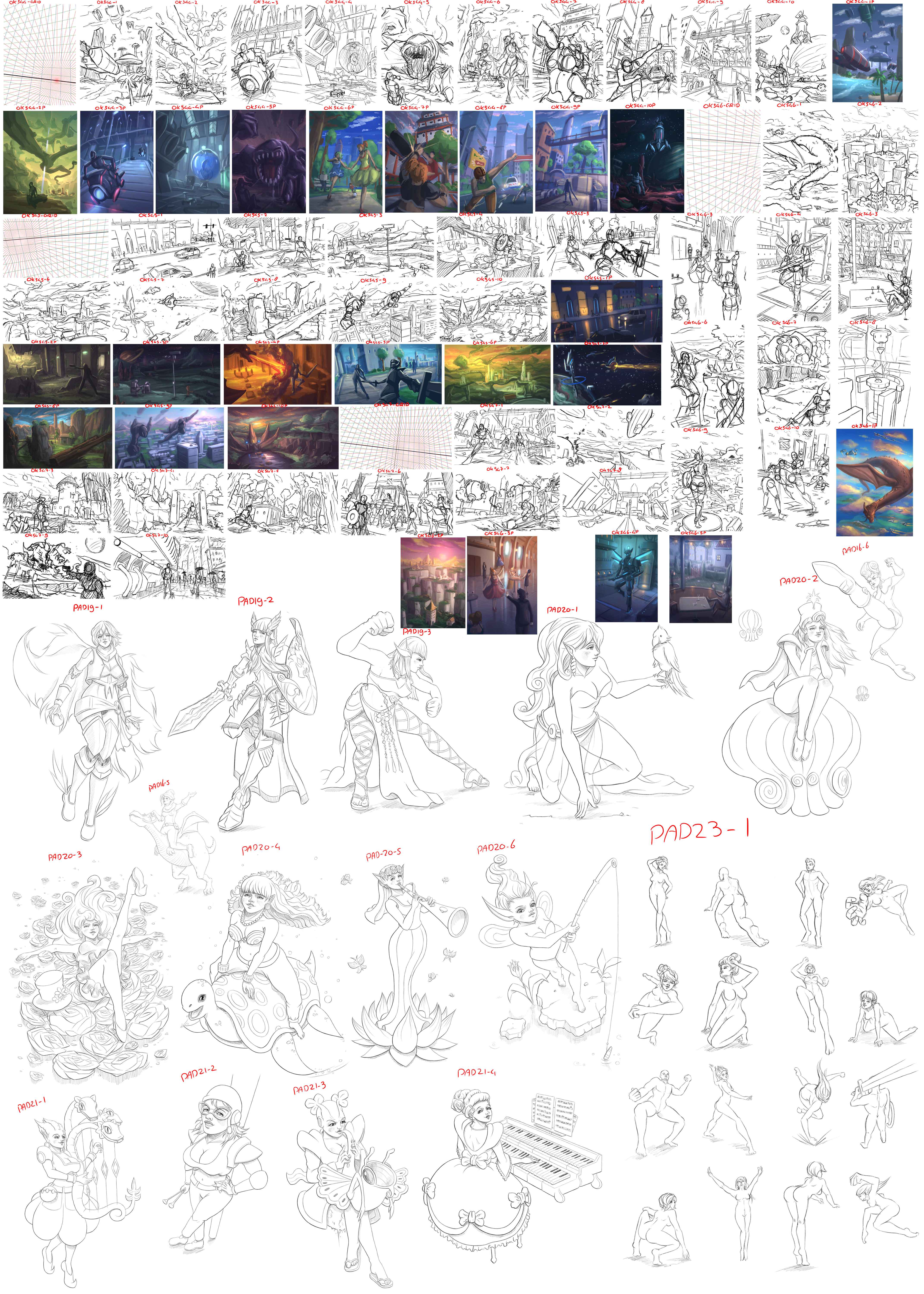
Like last month I did some compositions and some pose practice sketches. Because I had some time left after making 40 compositions, I decided to try and give them a quick 30-60 minute paint job.
Here I will post my comments of what I think of my works.
Ok544-GRID
Vertical canvas (5:7) – Low horizon
- Ok544-1 – iiiiiiiiiiiiuuuuuwwwww! Not very good
- Ok544-2 – Sorta like the repeating pattern of the trees going up
- Ok544-3 – nnnnniiiiuwwwww zuwuwuwuwuwu mkay
- Ok544-4 – To empty on the middle ground
- Ok544-5 – BLAAAAAAAAAAARG!
- Ok544-6 – I kind of like this scene. I like the interaction between the characters.
- Ok544-7 – Crappy background. Characters are to stiff
- Ok544-8 – Skating!
- Ok544-9 – Background is sorta interesting, though there is not much going on here.
- Ok544-10 – Looks very flat to me.
- Ok544-1p – Crappy paint
- Ok544-2p – Like the atmosphere in this painting
- Ok544-3p – I like how the lights turned out.
- Ok544-4p – Not enough colors
- Ok544-5p – BLAAAAAAAAAAARG!2
- Ok544-6p – Wow, this painting looks so crappy! The sky is way to dark and there is to little contrast.
- Ok544-7p – wow, so bad!
- Ok544-8p – Not so good, bad contrast
- Ok544-9p – meh
- Ok544-10p – to dark, to little contrast
Ok545-GRID
Horizontal canvas (16:9) – High horizon
- Ok545-1 – Scale looks off. Also boring.
- Ok545-2 – Kinda meh, but could work.
- Ok545-3 – bluh
- Ok545-4 – Like the dragon in the foreground blocking part of the drawing.
- Ok545-5 – ewwww
- Ok545-6 – Looks way to 2D
- Ok545-7 – Lacks any kind of focus. Looks just like some random objects floating in space.
- Ok545-8 – nope
- Ok545-9 – I sorta like this one. It has some amount of depth to it and the scene could tell a nice story.
- Ok545-10 – hmm hmm not super bad, but a bit boring.
- Ok545-1p – Yeah for reflecting city lights! I like the high contrast of the lights.
- Ok545-2p – Mkay, this looks kind of nice. The contrast is subtle, but it’s still there.
- Ok545-3p – ewwww. I need more practice painting space scenes
- Ok545-4p – The smoke and the character looks so bad. Ruins the rest of the painting that looks okay-ish to me.
- Ok545-5p – nope
- Ok545-6p – N, I am not using drugs
- Ok545-7p – meh
- Ok545-8p – How could this have come out good?
- Ok545-9p – I like the light and colors building from the back
- Ok545-10p – I like the contrast of colors in the sky
Ok546-GRID
Vertical canvas (5:7) – High horizon
- Ok546-1 – Grrruuuuuuuuu draaaaagoooooooon!
- Ok546-2 – Sorta like the build up from the front to the back.
- Ok546-3 – Classy!
- Ok546-4 – okay
- Ok546-5 – Ground is a bit empty. Also character sux
- Ok546-6 – wut? Scale is totally off
- Ok546-7 – The upper part of this composition looks so bad!
- Ok546-8 – nope
- Ok546-9 – Scale is not very good, character should be smaller. Other then that, this could work.
- Ok546-10 – fighting scene lulz! Inspired by old beat’em ups
- Ok546-1p – I love the colors.
- Ok546-2p – Looks pretty nice.
- Ok546-3p – yay more reflections! I like the color combinations
- Ok546-4p – Colors look okay
- Ok546-5p – hmm
Ok547-GRID
Horizontal canvas (16:9) – Low horizon
- Ok547-1 – Dunno
- Ok547-2 – Boring comp
- Ok547-3 – Ask mimo
- Ok547-4 – nope
- Ok547-5 – Scale problems
- Ok547-6 – I like this one. I’s sometimes good to use the other vanishing point as your focus.
- Ok547-7 – meh ish?
- Ok547-8 – Boring
- Ok547-9 – BLAAAARRRGGGG… BANG!
- Ok547-10 – Yay, rain. I love this one. I like the shape of the building on the left.
Character pose practice
- Pad19-1 – yeah
- Pad19-2 – This is some of the worst foreshortening I’ve done in a while
- Pad19-3 – More bad foreshortening
The following characters designs are all from my old trading card game.
- Pad16-5 – weeeeeeee
- Pad16-6 – Body twist looks wrong to me
- Pad20-1 – ok
- Pad20-2 – yes
- Pad20-3 – I have no idea how to draw roses, but kinda like this one.
- Pad20-4 – Neck looks weird
- Pad20-5 – How does she even play that instrument?
- Pad20-6 – Hands are sloppy
- Pad21-1 – Pose is boring. Hands don’t look very good.
- Pad21-2 – wut, yes?
- Pad21-3 – Couldn’t get the legs right. Who needs legs anyway?
- Pad21-4 – Hope she doesn’t play the music on the sheet
Pad23-1 – Some quick poses. Most of them look bad I guess.
Conclusions
- Repeat patterns in background
- Use more foreground elements
- Try to tell more of a story with the compositions
- Work on that scale
- Use all three dimensions, instead of a focus on just two
- Start paintings with a gradient and use those two colors as the two main colors of the painting
- Start the painting with a large soft round brush, so I can focus on the lights, colors and shadows, instead of painting shapes from the start.
- Use multiply and dodge layers very early on to establish all of the value range before starting with the actual painting
- Characters is still mostly foreshortening problems and hands.
Oh, my outfits are still getting some use. I have a few new ones, I guess I'll send them your way. I have a nice wizard look I like now.
I don't know what foreshortening is, but I agree that the proportions of those two shots don't look right. The right fist in the dancer's outfit especially.
I love that shield and the... loin cloth? Skirt? I don't know what that's called. But the detail is great.
Also, I think it's funny you drew the strength class in a graceful pose, and the agility class in a strong pose.
The knight pose looks familiar. I thought it was the PSI opening screen, but that's a different pose.
Art practice update or riot!
I was to lazy to compile my stuff from last monthIt's just more of the same stuff I guess.
Maybe you can just post the stuff you liked the most, or the stuff where you learned the most from. I like keeping up with your progress.
Well, there wasn't much progress last month, so nothing exciting to show. It's just the same stuff as last month. Bunch of characters, bunch of poses, bunch of compositions.
Only noteworthy thing is I decided to stop with the compositions, because they started to drive me mad and I couldn't come up with anything interesting without repeating compositions and designs. I am now doing other stuff to practice on.
Well, basically April was the worst month so far in terms of practice.
And how are you supposed to motivate me dude?!
Uh "You can do it!" "You're the best!" "Practicing is fun!" "Socks!"
 Posting Permissions


 Reply With Quote


Connect With Us